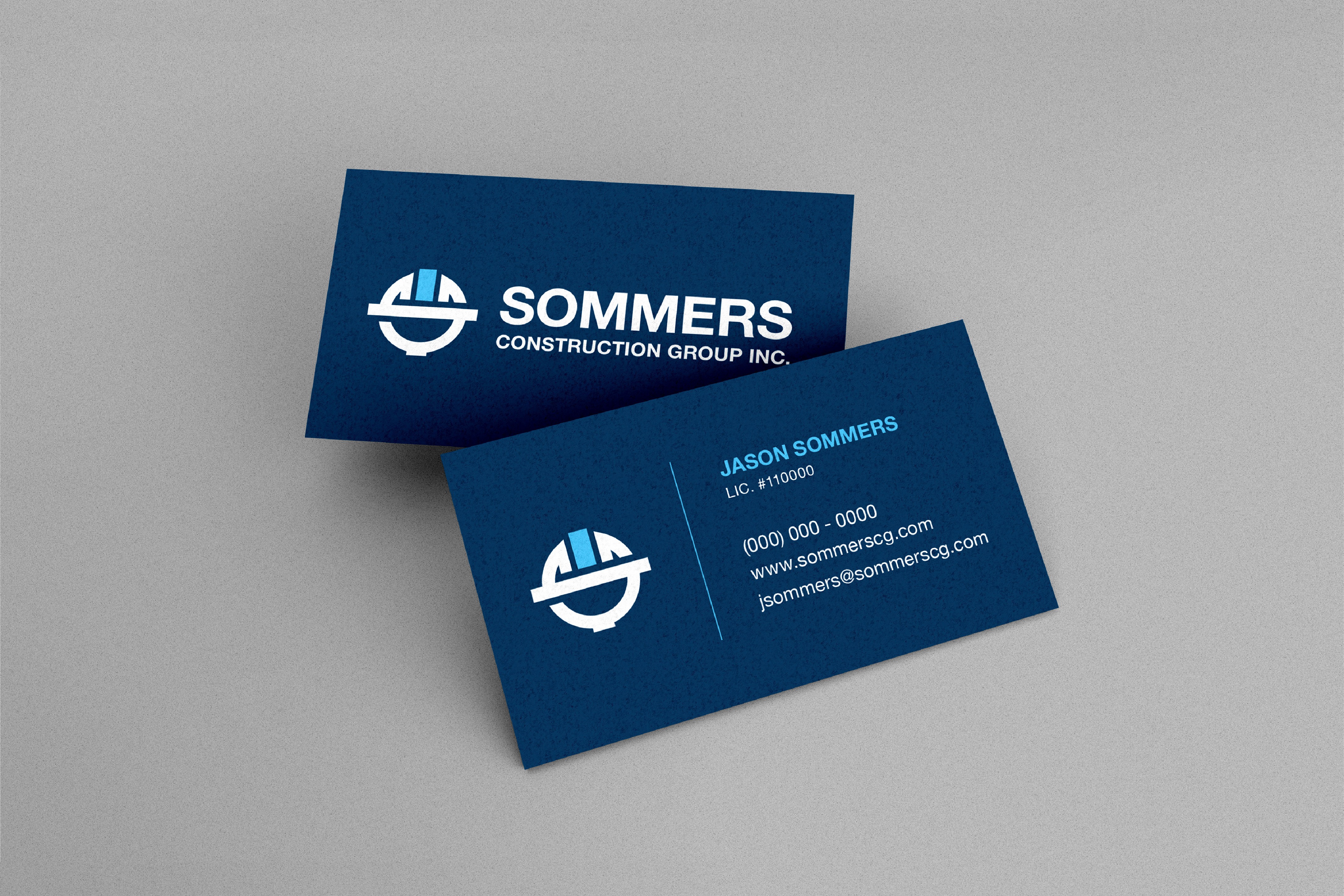
SOMMERS CONSTRUCTION GROUP INC.
Role
Lead Designer
Year
2023
Category
Logo Design

THE SCOPE
01
Project Overview
02
Challenges
03
Approach
04
Result
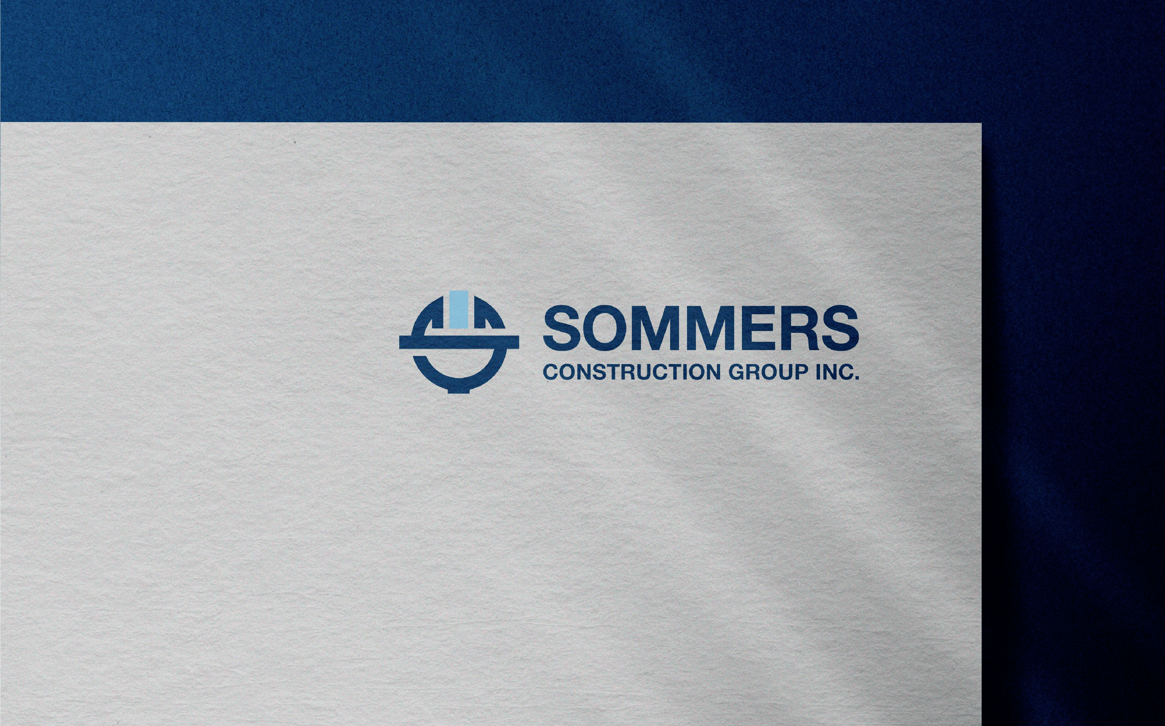
Sommers Construction Group Inc. approached me with a logo that, while functional, had potential for refinement. Their goal for the new logo design was to create something unique within the construction industry that balanced professionalism with visual appeal. To differentiate themselves from competitors, it was crucial to develop concepts that not only empowered the client but also reflected the high quality of their work.


FROM IDEATION TO CREATION
SKETCHES
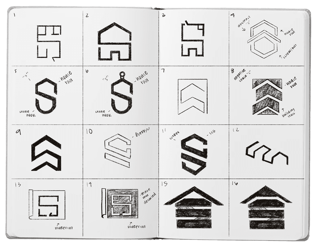
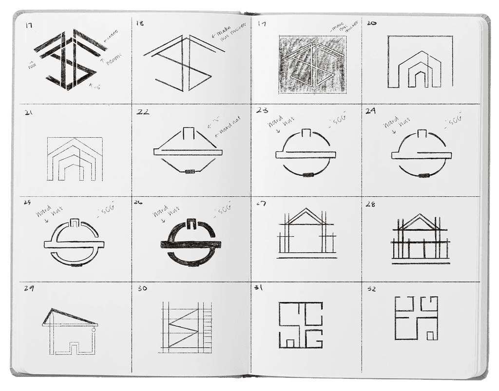
Prior to sketching the client had requested options for a pictorial mark that would later be combined with a wordmark. A rough series of sketches were developed that showcased various elements within the construction community. From blueprints, to building structures the client was able to clearly identify which marks caught their eye and those that didn't reflect their vision.
COMPS
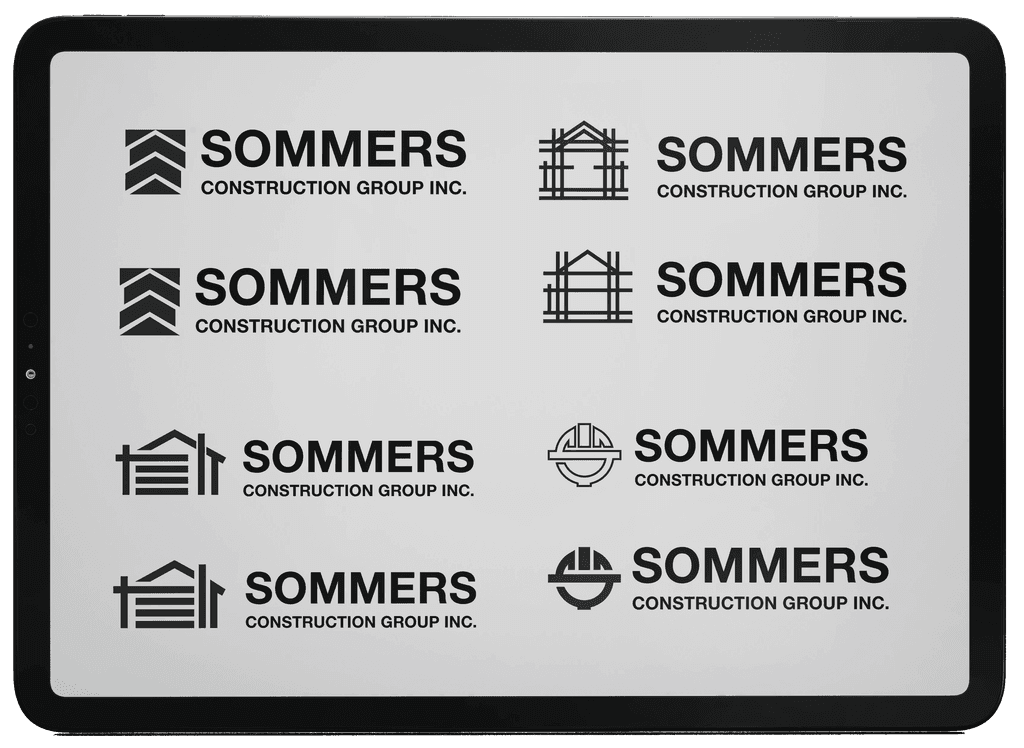
Following a comprehensive review of the sketches and a discussion of the design inspiration with the client, we developed a series of detailed compositions from the preferred sketches. I then guided the client to a final decision by providing insights into potential scalability issues and ensuring the selected designs would uphold their structural integrity.


SKETCHES
Prior to sketching the client had requested options for a pictorial mark that would later be combined with a wordmark. A rough series of sketches were developed that showcased various elements within the construction community. From blueprints, to building structures the client was able to clearly identify which marks caught their eye and those that didn't reflect their vision.
COMPS
Following a comprehensive review of the sketches and a discussion of the design inspiration with the client, we developed a series of detailed compositions from the preferred sketches. I then guided the client to a final decision by providing insights into potential scalability issues and ensuring the selected designs would uphold their structural integrity.


LOOKING FOR MORE?
Keep exploring, there's so much more to see.
SEE MORE

I WOULD LOVE TO HEAR FROM YOU
Whether you're looking to know more about a project or just looking to say hello, please feel free to reach out!
LET'S GET IN TOUCH

I WOULD LOVE TO HEAR FROM YOU
Whether you're looking to know more about a project or just looking to say hello, please feel free to reach out!
LET'S GET IN TOUCH

I WOULD LOVE TO HEAR FROM YOU
Whether you're looking to know more about a project or just looking to say hello, please feel free to reach out!
LET'S GET IN TOUCH

I WOULD LOVE TO HEAR FROM YOU
Whether you're looking to know more about a project or just looking to say hello, please feel free to reach out!
LET'S GET IN TOUCH
